This portfolio will cover the development of digital graphics. I use a range of tools and features that help me build up to the final design of the Anaesthetic poster, as well as its DVD cover and sleeve.
Quick Selection
One major skill I needed to learn was how to select objects of interest. There are multiple ways of these tools in photo-shop, and the method would vary depending on the type of object that needs selecting. This can vary between simple things like doors or tables, or something more tricky such as hair or trees.Magic Wand Tool
The most easiest to use, the magic wand tool is effective mainly if the background you are selecting is a solid color.
The image must be in a layer, clicking on the background layer and choosing the 'layer from background' box, and then using the magic wand tool to click on the background. After that, with the background selected, you can delete it, and place a new background underneath.
Color Channels
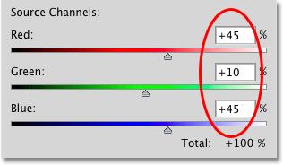
The more complex selection, the Color Channel deals mainly with things such as hair.
By using the color channels to brighten and contrast the original picture, I am able to make the object I need in pure black of color - including each strand of hair - while the background is contrasting, and therfore pure white. This gives me the chance to select the object easily as it is contrasting from the background. I can then delete the background, or place the object I want into another image.
I attempted this tool multiple times, since our two main actors for Anaesthetic had hairstyles that would need to be precisely cut.
This tool is tricky and time consuming but worth it, if you have objects with precise and delicate strands of hair.
Color Experimenting
Photoshop offers a wide range of tools you can use to affect the color of the pictures. You can reduce the hue and saturation, increase the darkness, or make it translucent.
These simple tools can help a project greatly, they may set the picture in a certain time period, or just make it seem more aesthetically pleasing.
Final Cut
The finished product of the poster is below. The color channel tool is the one which was mainly used in the making of this.
Also the DVD cover, which covers a lot of toning down the saturation to give the pictures more of an old fashioned look.
I regret not experimenting with other tools, as there are many I have yet to discover, but I have not fully familiarized myself with photo shop yet, and will still need to go over the basic tutorials. However overall I feel like I have gained enough knowledge to try things again.
http://www.webdesign.org/photoshop/photoshop-basics/5-quick-selection-tool-in-photoshop.21990.html


No comments:
Post a Comment